Power Tools
It’s not easy to hit the right balance between making thing easy for new or infrequent users and enabling power users to be very efficient. It’s even harder for a tool like Slack, which by definition has to be universally adopted in order to succeed.
This is why it’s particularly important to note the discussion about the recent changes to Slack’s editing functionality. The editor used to use Markdown, which is the sort of thing power users love, but others, eh, not so much.
Markdown was created as a a quicker and simple alternative to HTML, but with the aim of catering to the sort of people who would otherwise be crafting HTML by hand in a text editor window. I can pop open BBEdit or vi, start right from
<html>
<head>
<title>This is my new document</title>
and go from there, but it’s a bit of a faff. Markdown makes it easy for me, a power user, to be more productive.
The problem with Markdown, especially when it’s implemented inline like Slack did, is that it’s not particularly discoverable. Unless you already know what Markdown is and that it’s supported in whatever window you’re typing in, you’re unlikely to stumble across the functionality by accident.
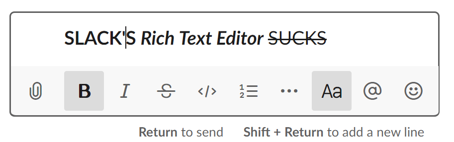
This is why Slack built a rich text editor which shows all the functions – bold, italic, list, hyperlink, and so on – visually in a toolbar. This makes it much easier for people to add formatting to their messages who might never have done so in the past – and anecdotally, that is exactly what I have been seeing. This is known as a WYSIWYG editor, where the acronym stands for “What You See Is What You Get”. Appropriately enough, I first became familiar with the concept when the first WYSIWYG editors for HTML started to come out. Those of us who were used to hand-crafting our HTML by hand in text editors scoffed at the inelegant HTML these tools produced, but they were quickly adopted by vast numbers of people who had been intimidated or were simply turned off by the blank stare of a new text editor window.
WYSIWYG tools are a major democratising force, opening up functionality to huge groups of users who would not otherwise have had access to them. However, as with many user-assistive functionalities, they need to be implemented with care so that they do not become obstacles for users who do not require (or prefer to do without) their assistance.
The problem in Slack’s case is that the way the WYSIWYG editor is implemented breaks Markdown quite badly. In fact, the reaction got so bad that there is a Chrome plugin to disable the new editor.
To their credit, Slack are apparently walking back the changes and will rethink their approach:
Our recently introduced WYSIWYG formatting toolbar was developed with that broader customer community in mind. We thought we had nailed it, but we have seen an outpouring of feedback from customers who love using Slack with markup.
I don’t necessarily blame Slack for the original miss; it’s not easy to combine direct editing with WYSIWYG in the same window, and testing for all the edge cases of a markup language like Markdown is by definition a hard problem. It’s also worth noting that, in terms of percentage of user base, these Markdown issues will hit a very small number of people. The problem is that those are also the most passionate and dedicated users, so upsetting them will have disproportionate effects on user satisfaction overall. Also, kudos to Slack for listening to feedback and revisiting the changes.
This whole débacle does speak to a more general problem though. I liked early search engines, where you could type
“this phrase” AND “that phrase”
with a reasonable expectation of getting only matches that contained both of those phrases. Instead, search engines nowadays will “helpfully” try to work out what you really meant and return that instead, and it is frustratingly hard to persuade them to stop trying to help and get out of my way.
Providing assistive interfaces for those who need them is both a Good Thing in general, and good for product growth. Power users who are dedicated to learning something will jump through whatever hoops they need to jump through, but casual users will bounce off a learning curve that is too steep. The best match would seem to be a toggle somewhere that lets power users turn off the helpful interjections and talk directly to the machine (see also: autocorrect).
By giving both groups of users what they need, a user interface with this dual nature will both deliver easy onboarding of new users, and enable power users to work efficiently. I hope Slack figures it out quickly and becomes an example of Doing It Right.