Windows 8 fun
Windows 8 fun
Since I want to be able to disparage it scientifically and with knowledge aforethought, I downloaded the Windows 8 Consumer Preview.
First off, and already quite questionable: the first download users are offered is actually an installer which will run on a live Windows 7 install and irreversibly upgrade it to Windows 8 CP. Excuse me? Why in the name of Great Cthulhu would I ever want to do that? Fortunately it’s also possible to get ISOs, so that is what I did.
The free VMware Player makes it super easy to try out a different OS for a while. I was already using it to power my nostalgia trip into BeOS (you can actually download a pre-configured image from here - how cool is that?).
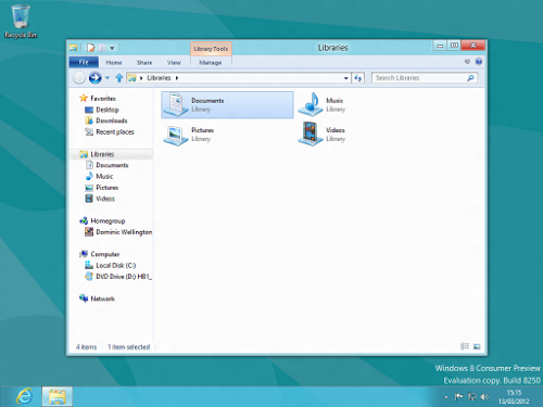
Once the ISO is downloaded, Windows 8 installs pretty quickly. It wants a Windows Live! account for the default login, so I used mine and signed in. At this point you get the now-famous Metro UI, with all its various tiles. Behind this there is actually a normal Windows desktop, which apart from the absence of a Start menu would not be too unfamiliar even from Windows 95. The Metro tiles replace the Start menu, or at least its launcher functions, but more on that later.
I decided to spend my time in Metro, since that is the main innovation in Windows 8 as far as I can tell. It quickly becomes apparent that this is by no means a desktop UX model, though. On a 26” monitor running at 1920x1200 pixels, the wasted screen real estate is horrific. I usually spend most of my customization effort in trying to cram more information onto the screen at any given time. Metro, with its drive to full-screen everything, is the antithesis of that model.
The apps look nice enough, although it took me a moment to figure out that a lot of functions require the “charm key” (Windows+C). Just pressing the Windows key takes you back to the Metro tiles, while a lot of app customization options, not to mention features like the control panel, only appear after pressing that “charm key” combination.
One annoyance is that IE is not the same in Metro as in the old-style desktop. For instance, Flash works on the desktop, but not in the full-screen Metro IE. This sort of minor inconsistency is par for the course from Microsoft, but it shows the pitfalls inherent in trying to create a unified user experience.
The main reaction to all this is “meh”. Why bother with this thing? We live in a world which includes the MacOS and all manner of X-based Linux desktop environments for desktop PCs, not to mention of course Microsoft’s own efforts in that direction. On the tablet side, there’s iOS and Android, both doing a pretty decent job already. What extra sauce does Windows 8 bring to the party?
Leaving aside Metro, which all desktop users will be eager to do after about five minutes, this is a Windows 7 service pack, if that. Metro might be a good fit for tablets, but not if it has Windows Vista crouching in its guts the way this preview does. Installing any of the millions of existing Windows apps sounds great in theory, but what actually happens is that each app creates several new tiles: the app itself, the uninstall icon, and the various other “helpful” icons that all apps seem mandated to install these days. It’s one thing when this cruft is hidden several levels down the start menu, but if it’s all going to be out in the open, things are going to get messy fast.
And if Windows 8 doesn’t include the Windows desktop everywhere, then what’s the point of unifying the desktop and tablet interfaces? A mouse pointer has an enormously greater level of precision than fingers, so any interaction model which has to cater to both will end up being compromised.
Tablets and desktops have different form factors and use cases. While there is a case to be made for some convergence, as Apple is showing with increased sharing between iOS and MacOS, I think Windows 8 takes that convergence a bit too far, and the result is half-baked. It’s a pity, because I do like the Metro UI - just not on my desktop PC.