Assisted living
Topics: tech
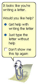
Okay, call me a huge snob - you won’t be the first - but mass adoption of computers has brought some downsides. Interfaces have all sorts of helpful features which are designed to assist people unfamiliar with computers to navigate them successfully. The trouble begins when those features get in the way of users who do know their way around - and there’s no way to turn them off.
One relatively recent example is the shared URL and search bar. Time was, all of a couple of years ago, browsers had one field where you could enter an address, and a different, separate field where you could enter a search. Because they were separate fields, both users and auto-completion algorithms understood which was which, and everything worked fine.
Then the Chrome developers decided that two fields was one too many, and they would rather everything went through Google anyway. That’s fine, that’s their prerogative. The problem is, all the other browsers followed them over the Cliff of Stupid, and got rid of the separate search field. It used to be that if I wanted to access a host on my local net, I could type “gandalf” in the field and get sent to http://gandalf. No longer! Now I get Google results for “gandalf”. Whyyyyy
Another favourite, related to the previous item: Google auto-correct for search terms. Search for “bursty synonym”? Google asks “did you mean busty?”. NO I DANG WELL DID NOT MEAN “BUSTY” - and thanks for getting that word into my search history!
Lest you think all my gripes are with Google, traditional desktop software such as Word is just as bad. I have complained before about its “intelligent” selection, which automatically expands the selection to the nearest whole word, regardless of whether that was what the user wanted to or not.

The logical end state of all this is that we pay extra to have all wizards and assistive features turned off - much as it now costs more to get T-shirts that don’t have stupid logos or slogans all over them.