A Good Old-Fashioned Platform War
I think I remember how to do this
It’s been a while, but a good old-fashioned platform war just brewed up in LinkedIn comments. What is this, 1995?
I switched from Windows to Mac in 2017, and one huge thing has been both amazing and consistently confusing.
For such an amazing piece of hardware, and a generally really usable operating system for a developer….
💩 Why is “finder” such a complete & flaming piece of sh!t? 💩
I mean really, the BASIC stuff I CAN’T do in “Finder” is really beyond the pale.
How did hashtag#apple manage to so fundamentally break copy and paste in a file system interface? How do armies of people work there and design delightful things and yet use this piece of trash routinely?
Come on Mac fans - help me. Tell me about the genius I’m so oblivious to here, because I’d pay real money for the !@#$%^&* explorer interface from WindowsNT over Finder.
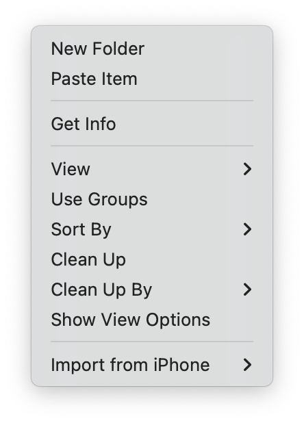
People are popping into the thread and literally complaining that they can’t copy files from one Finder window and past them into another (this works fine), or that there is no one-click way to create a new folder in place (technically it’s two clicks, in that you have to pop open a context menu first, but then it’s literally the first option).

I come not to bury Windows
I complain about Windows — well, not so much recently, since I haven’t had to touch it in ages — but that complaining comes from a place of knowing how it works pretty well. Windows was my primary desktop OS for over a decade, after all, and there are still some features that I wish macOS would adopt. For instance, if you take a Windows Command Prompt… window1 and slam it against the side of the display, it goes full-height and attaches itself there. This is great if you’re doing something where you need a looooong window (reading a man page, or dealing with a complex sequence of commands), or just need a place to put the window where it’s out of the way but also easily accessible.
Sure, there are macOS tools that let you do that sort of thing (I’m partial to Rectangle myself), but once you start broadening your scope to include third-party add-ons, at that point it’s just a matter of personal preference, since any functionality gap or difference in UX can probably be addressed that way.
One hands-down winner used to be to point out that at least macOS had a “proper” Terminal built-in, but these days with the Windows Subsystem for Linux (WSL), that’s a lot less of a factor. This isn’t exactly delivered with the OS, but it’s a well-supported component from the OS vendor, so I’m inclined to allow it.
A comment in that thread that I actually agree with was about the Keychain. I have never understood why this functionality has to be hidden away, half in Safari and half in an obscure half-hidden system utility. A feature this important should get its own top-level Control Panel, I mean Preference — dagnabbit, Setting, where accounts could all be managed in one place. Maybe this is something we can look forward to in macOS 15 in September?
It’s all about the UX
Bottom line, though: if you’re suggesting that macOS, of all platforms, doesn’t support copy-paste well, I suspect you might be bringing some Windows muscle-memory along that is getting in the way somehow.
This is at some level a valid complaint: Apple should not assume that everyone has been using their platform since the Eighties, like I have, and has internalised all its little idiosyncrasies (proxy icons are probably my favourite). There is always a compromise between offering new users an easy and well-signposted on-ramp to the platform, and getting out of the way of power users who know what they’re doing thankyouverymuch. Until today, though, I would not have thought that copy-paste or creating a new folder would have fallen on the wrong side of that divide.
-
Good at dominating markets, not so much at naming things. ↩